MMeridian Design System2 min read
Building a scalable design system from scratch for 10+ enterprise products.
Meridian needed one consistent language across foundations, components, and patterns — extracted directly from Figma tokens and shipped as a living, browsable HTML reference rather than a static style guide.
- Role
- Design System Lead
- Scope
- 10+ products, 5 nav groups
- Source
- Figma token extraction
- Year
- 2023
Challenge
Ten-plus enterprise products drifted apart because every team rebuilt the same patterns with no shared source of truth.
Strategy
I built foundations, component families and patterns from a single Figma token source, documented for both designers and engineers, with governance defined up front.
Results
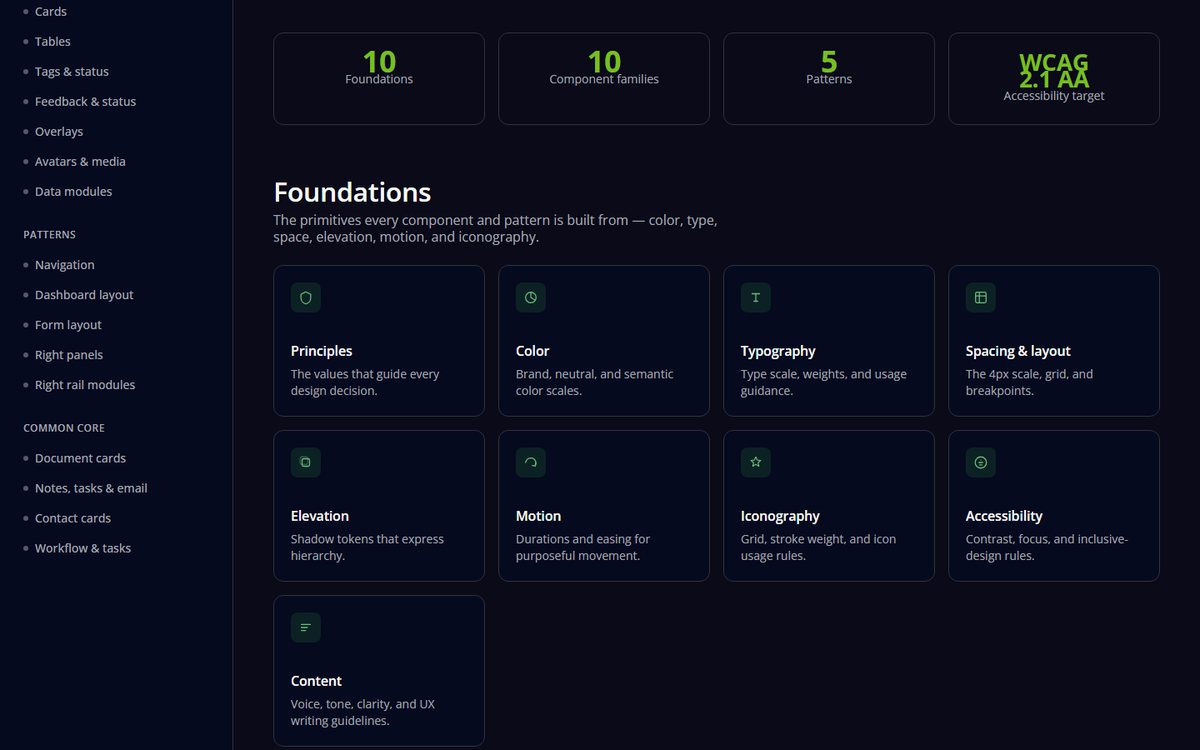
One traceable system across 10+ products, with WCAG 2.1 AA applied to the foundations.
overview
Overview
Meridian's product surface had grown to span 10+ product areas — dashboards, claims workflows, document handling, communication tools, and more — each built slightly differently, with colours, spacing, and components drifting from the original Figma designs. The goal was a single design system that engineering and design across every one of those products could trust as the source of truth.
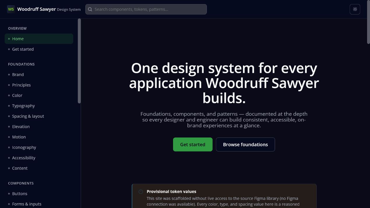
Rather than a static PDF or a Figma-only library, I built the system as a browsable, versioned HTML reference — foundations, components, and patterns all rendered live from the same token set the product actually ships with.
tokens
Token system
Colours and typography were extracted directly from Figma metadata — hex values read from labelled text nodes on the source Color canvas — rather than eyeballed from screenshots, so the tokens matched design intent exactly.
- Primary brand — Brand Green 01/02 and Brand Dark 01, mapped to buttons, logo, and nav surfaces.
- Neutral scale — an 11-step grey ramp from Black 100 to White, standardised as
--gray-50through--gray-900. - Utility colours — alert, warning, and success states, plus generic tag backgrounds.
- Typography — Open Sans across four weights, with a defined type scale from a 10px micro-label up to a 36px H1.
Where Figma metadata didn't expose an exact hex label — secondary/tertiary and data-display accents — I flagged those swatches explicitly as approximations rather than presenting guesses as ground truth, so engineering knew exactly which values were safe to hard-code.
structure
Structure
The system is organised into five navigation groups spanning 10+ product areas, growing from 20 to 29 pages as gaps were identified against the source Figma file:
- Overview (2) — landing and getting-started guidance.
- Foundations (8) — principles, colour, typography, spacing/layout, elevation, motion, iconography, accessibility.
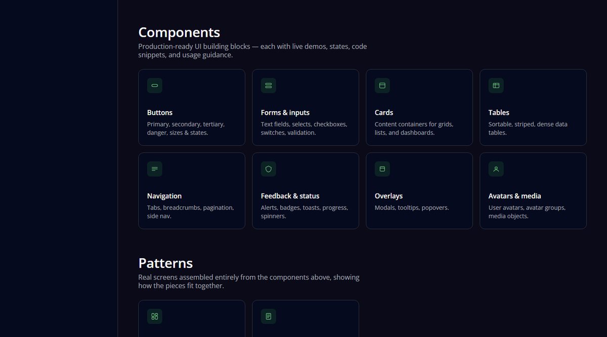
- Components (11) — buttons, forms, controls & tabs, cards, tables, tags & status, navigation, feedback, overlays, avatars, data modules.
- Patterns (4) — dashboard, form layout, right panels, right rail.
- Common Core (4) — document cards, notes/tasks/email, contact cards, workflow tasks — the shared building blocks specific to the claims domain.
Every new component family shipped with matching CSS classes in a single shared stylesheet — tabs, counters, tags, status pills, content modules, panels, document and contact cards, workflow cards — so engineering could adopt components without re-implementing patterns per page.
outcome
Outcome
The result is a design system that reads as one product rather than a patchwork — every component traceable back to the same Figma tokens, and every gap between "what Figma shows" and "what shipped" made visible instead of silently papered over.
Honest about what is not connected yet
The published site carries a provisional-token notice where values were scaffolded without live access to the source Figma library. Flagging that in public is deliberate: a design system that hides its gaps trains people to distrust all of it, and the note disappears the moment the library is connected and the real tokens are exported.