
IIndia Ka Bazaar · ONDC4 min read
Making everyday commerce feel dependable.
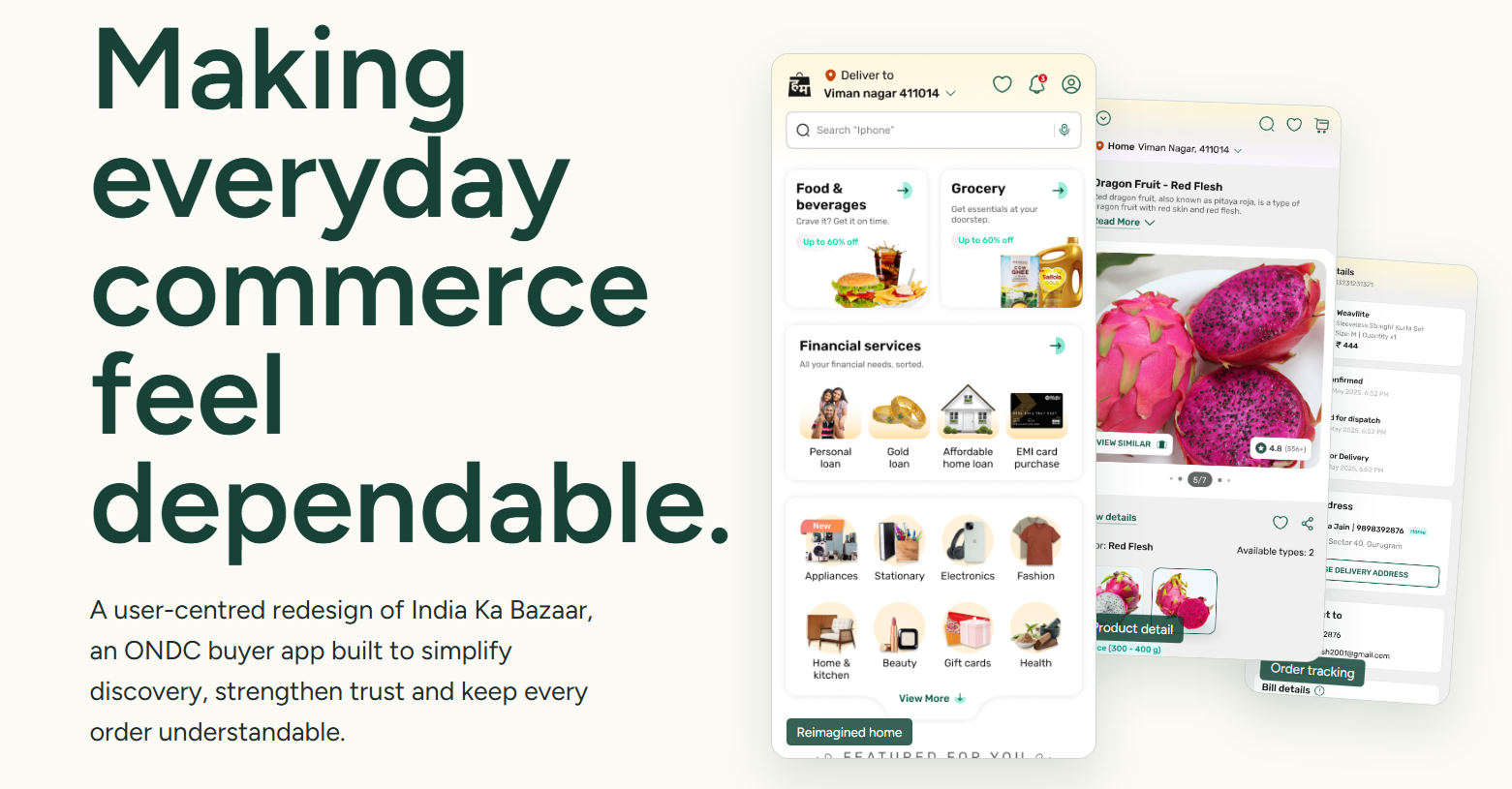
A user-centred redesign of India Ka Bazaar, an ONDC buyer app built to simplify discovery, strengthen trust, and keep every order understandable — from onboarding through post-order support.
- Role
- Strategy, Research & Interaction Design
- Scope
- Onboarding to post-order support
- Platform
- ONDC buyer app — retail, food, payments
- Year
- 2025
Challenge
An ONDC buyer app had to earn shopper trust across sellers, catalogues and logistics partners it does not control.
Strategy
I designed for three distinct shopper confidence models and made ecosystem dependencies visible instead of promising outcomes the app could not guarantee.
Results
Six flows rebuilt as one continuous journey, from discovery through post-order support.
overview
Overview
India Ka Bazaar had the ambition of a super-app, but its home experience asked people to work too hard to understand it. Shoppers read sparse design as unfinished, and dense design as hard to navigate — the revamp had to preserve the energy of shopping while making decisions feel safer.
The complexity wasn't only visual — it was structural. India Ka Bazaar is a buyer-facing layer on ONDC (India's Open Network for Digital Commerce), where catalogues, sellers, logistics partners and service quality all sit across a distributed network. India Ka Bazaar owns discovery, cart, checkout, support and customer communication; ONDC enables interoperable transactions but isn't the merchant or fulfilment provider; sellers and logistics partners supply catalogue, availability, and delivery signals. The design had to make those ecosystem dependencies visible rather than make promises the app itself couldn't control.
research
Research
We used a moderated home-page comparison study, profile data, and task analysis already conducted for India Ka Bazaar to separate surface preference from the confidence people actually need to complete a purchase — listening for the specific moment trust breaks down.
- Preference isn't simplicity — most participants preferred the more developed direction; a sparse layout often read as a basic or unfinished app, while clear discounts, seller quality, returns and customer care were repeatedly used as shorthand for legitimacy.
- Experienced shoppers move quickly and need familiar browsing patterns and deal visibility.
- Newer digital shoppers need visible, step-by-step guidance to act with confidence.
- Value-first shoppers need proof they haven't missed a better option before committing.
Preference is not simplicity
The moderated home-page comparison produced the finding that shaped everything after it: most participants preferred the more developed direction. A sparse layout read as a basic or unfinished app, while visible discounts, seller quality, returns and customer care were used as shorthand for legitimacy. "Simplify it" would have removed the very cues people used to decide the app was real.
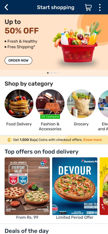
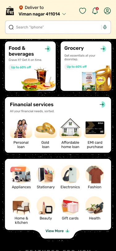
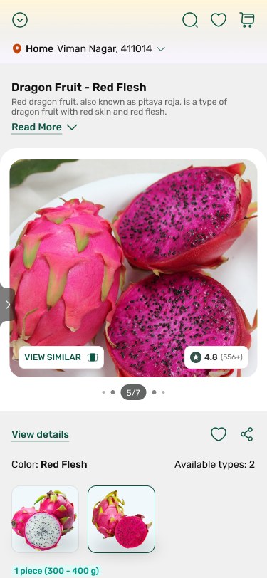
Before and after on the surfaces that decide trust: delivery context and search become the first decision, deals group into recognisable modules, and the product page brings price, delivery, returns and payment eligibility next to the action.
strategy
Strategy
Every visible change had a behavioural reason — the strategy wasn't a generic "simplify everything" brief. It set different requirements for different shopper types and used task priority to decide what belonged in the first release.
- Keep a rich, deal-led homepage but group content around clear shopper intents → more confident exploration without a promotional wall.
- Surface quality, delivery, return and support promises before purchase commitment → less hesitation at product pages and checkout.
- Use familiar patterns, visible payment choices, guidance and clearer result hierarchy → reduced interpretation effort across experience levels.
flows
Redesigned flows
The work moved from a diagnostic of the old experience to storyboards and wireframes, then into an integrated mobile flow connecting discovery, category browsing, product choice, payment, fulfilment and support into one continuous buyer journey — six flows redesigned end to end.
Home — give shoppers a confident first move
Promotional content, category entry and super-app services competed before the shopper could orient themselves. Redesigned to make delivery context and search the first decision, group deals into recognisable modules, and keep trust cues visible without overwhelming the page. Modelled impact (hypothesis, not a result). Directional targets set before build, to validate after release against first-product time and home-to-search/category CTR.
Category — a clear route, not a content maze
The category experience had too little hierarchy for shoppers to see the shape of the aisle or choose a fast path. Added explicit visual hierarchy, need-led shortcuts and repeat-purchase cues, and sequenced deals, daily needs and brands into a scannable route. Modelled impact (hypothesis, not a result). Directional targets set before build, to validate after release against correct-subcategory task success and time to destination.
Listing — turn results into comparable choices
Relevance, price, delivery conditions and availability weren't easy to compare at scan speed. Made query, filters and sorting visible at the decision point, structured cards around value/rating/delivery, and clarified the add-to-cart handoff. Modelled impact (hypothesis, not a result). Directional targets set before build, to validate after release against search success and filter adoption.
Product — place the proof beside the decision
Price, fulfilment and reassurance details were fragmented, leaving shoppers to infer dependability. Brought price, delivery, returns and payment eligibility near the CTA, and made quality and service cues decision-ready. Modelled impact (hypothesis, not a result). Directional targets set before build, to validate after release against PDP-to-cart conversion and checkout abandonment.
Cart & checkout — make the commitment legible
Delivery, offers, multi-seller fulfilment and the final bill were separated into a static item review. Grouped shipments and delivery promises, separated offers/contact/bill into a scannable sequence, and made the payable amount and next action unmistakable. Modelled impact (hypothesis, not a result). Directional targets set before build, to validate after release against cart-to-payment conversion and bill comprehension.
Order status — make a distributed journey accountable
A single status report didn't explain what would happen next or where support lived when delivery involved network partners. Turned status into a timestamped progress model with support, cancellation and order details kept nearby. Modelled impact (hypothesis, not a result). Directional targets set before build, to validate after release against status comprehension and repeat-order intent.
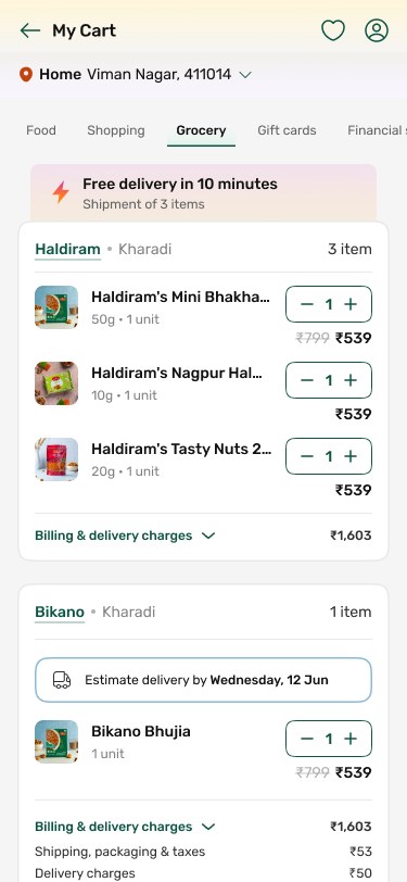
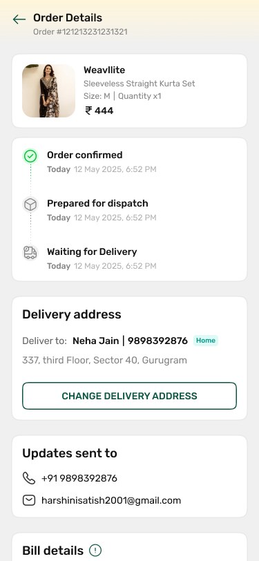
The commitment end of the journey: grouped shipments with delivery promises, a scannable bill, and a timestamped order status that stays accountable when fulfilment involves network partners.
outcome
Outcome
The modelled impact figures above are the design's projected effect, defined against specific metrics before build — task success, conversion, and comprehension — rather than retrofitted after the fact. The full interactive walkthrough, including every screen and flow, is linked above.